Graphic Prop Design
Props!
For this project, I took descriptions from some of my favourite books and pulled out aspects that, if they were to be adapted into a film, would require Graphic Design. Of course, nowadays, everything has been developed into a film, but these are my takes on some graphic props!
IT - Stephen King, Boat Making Equipment
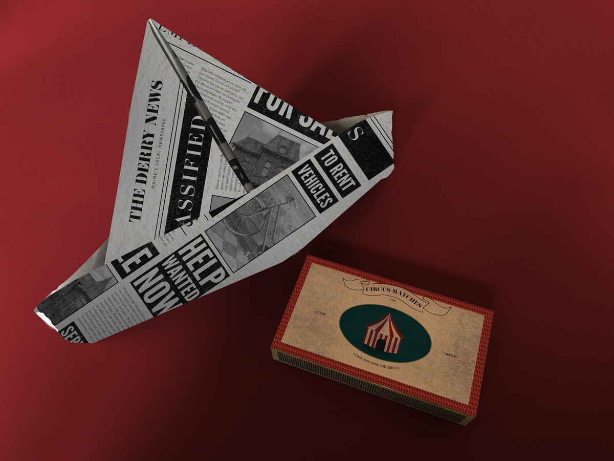
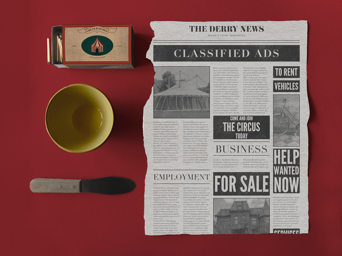
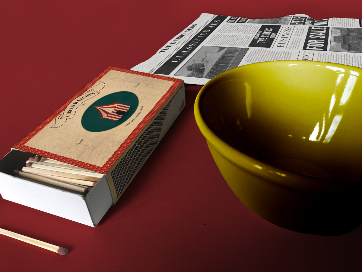
"The terror, which would not end for another twenty-eight years - if it ever did end - began, so far as I know or can tell, with a boat made from a sheet of newspaper floating down a gutter swollen with rain."
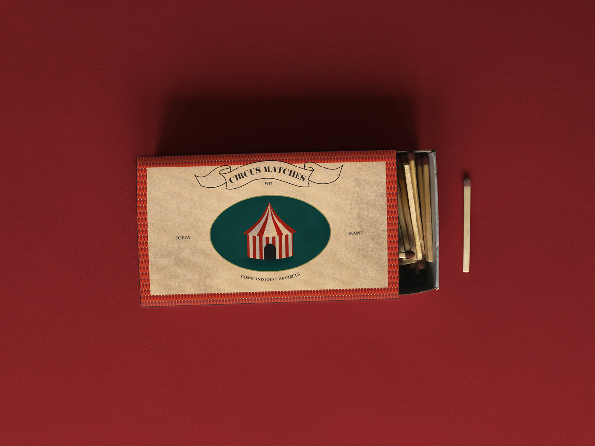
For this prop, I wanted to look at making the matches a subtle notion towards the “join the circus” motion, linking to the next scene where Pennywise appears, describing the circus to Georgie, his first victim of the film. The same with the newspaper, subtle adverts for the house on Niebolt street and a bike to rent. In the book, King specifies that the page of the newspaper is a torn out sheet of the classified section of The Derry News.
For the design, I looked to 1950's newspapers and matchbox designs for reference. I wanted there to be subtle storytelling in each piece, using clown hats to create a pattern for the matchbox.
The Help - Kathryn Stockett, The Book
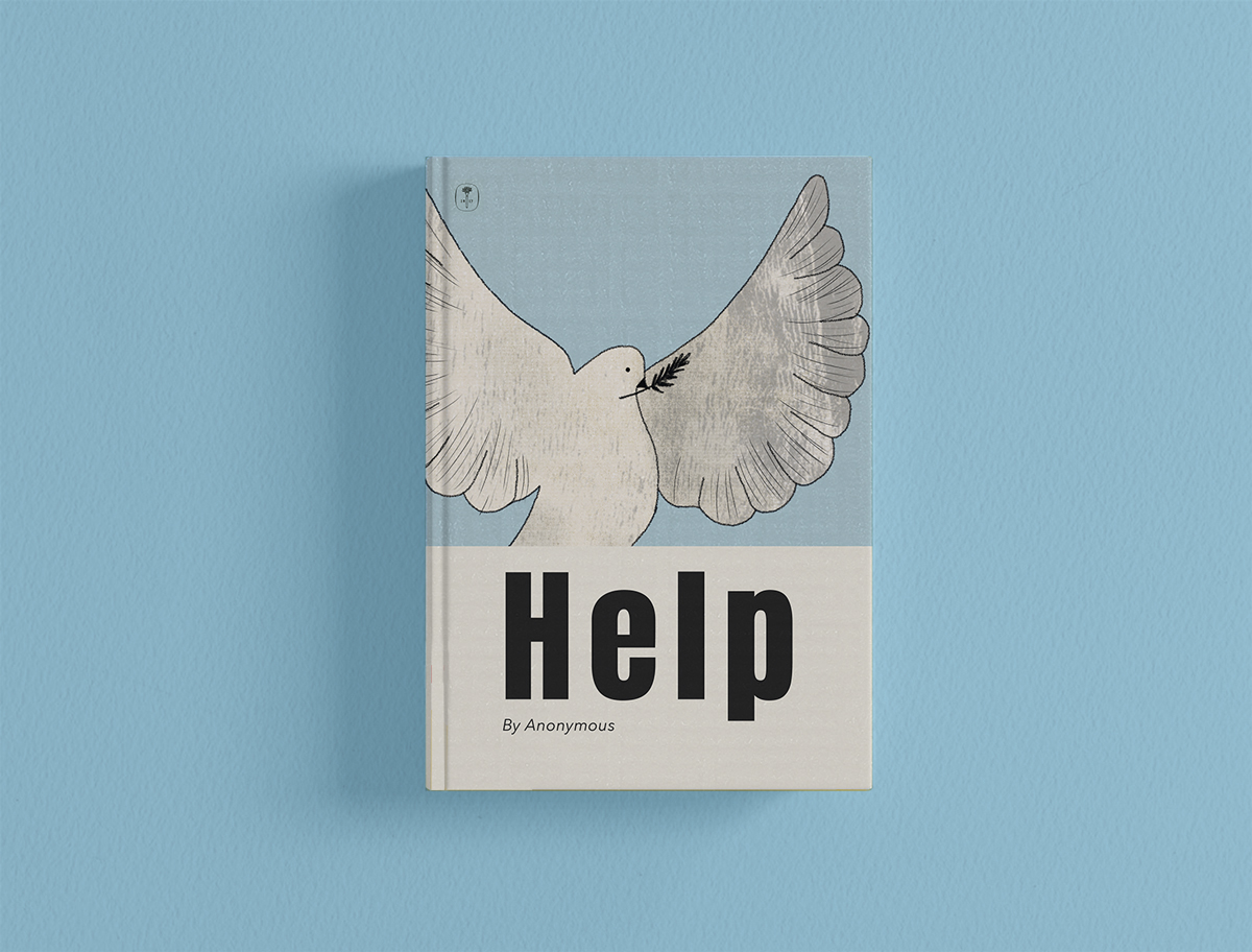
Aibileen describes the book as “the prettiest book I ever seen. The cover is a pale blue, colour a the sky. And a big white bird - a peace dove - spreads its wings from end to end. The title Help is written across the front in black letters, in a bold fashion. The only thing that bothers me is the who-it-be-by part. It say by Anonymous.”
I looked to 1960s book design for this and created a simple illustration and book cover based on the description from the book. As Aibileen describes the book as “the prettiest book I ever seen” I wanted the cover to be simple but beautiful using a limited colour palette and reflecting the white dove in the bottom third of the book to develop a certain symmetry.
Harry Potter - J.K Rowling, Spew
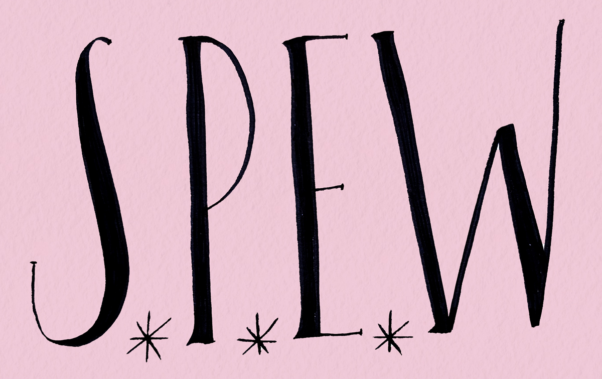
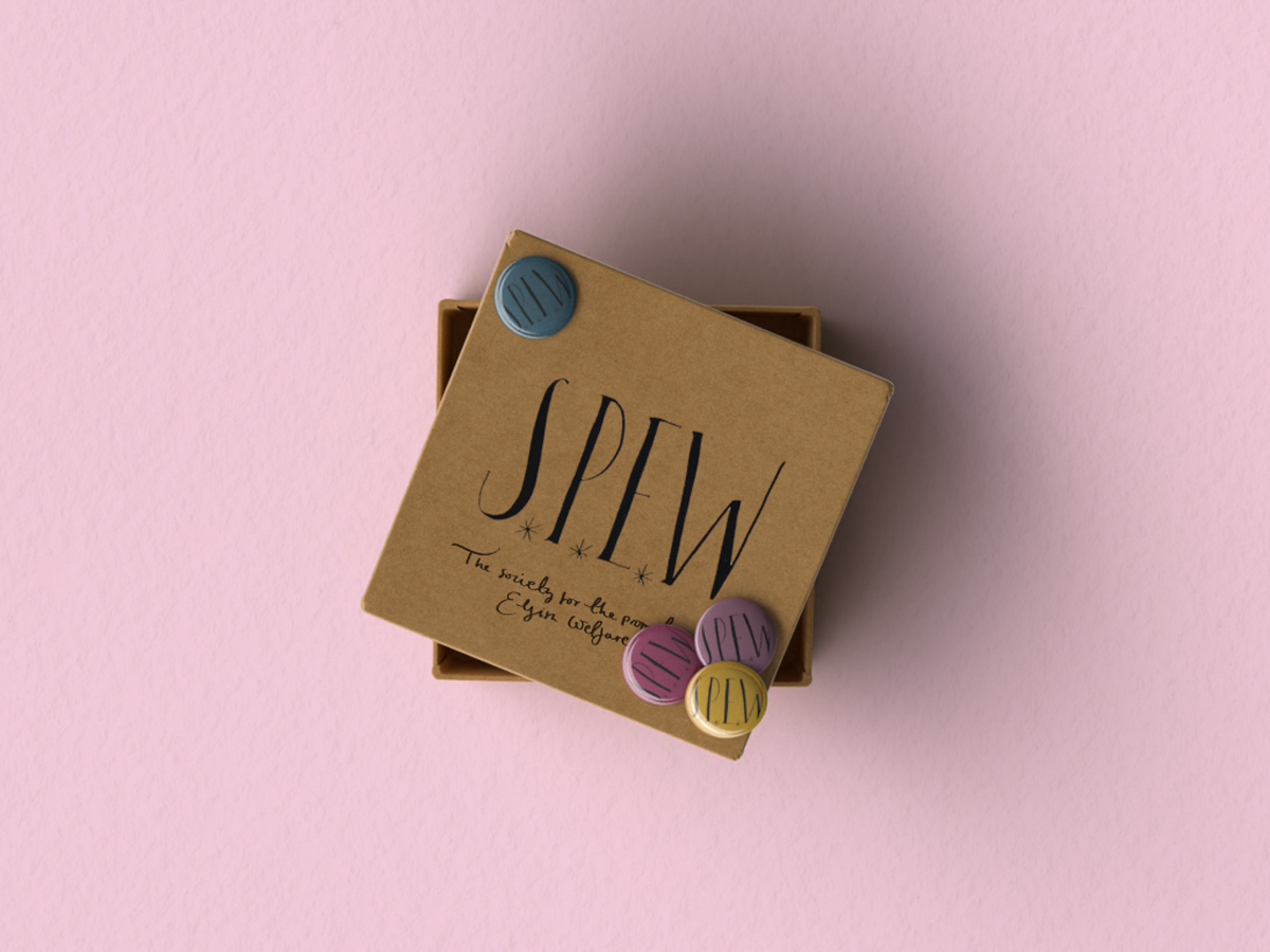
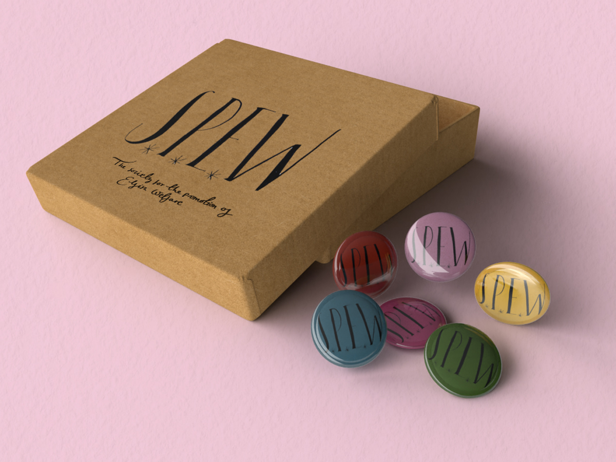
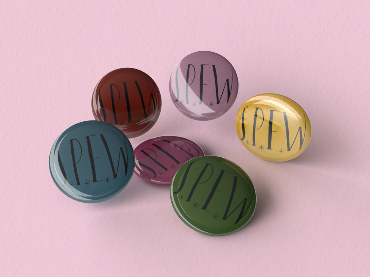
Hermione enters the common room carrying a box “whose contents rattled as she walked”. She later opens the box to unveil its contents “inside were about fifty badges, all of different colours, but all bearing the same letters S.P.E.W”.
As MinaLima, designers for the Harry Potter films mention, they interject a little magic into ordinary things. Like the Gatsby props, I looked to think about how Hermione would make these badges, thinking about her handwriting. Hermione is smart and practical and so I figured her handwriting would be neat but also curly and feminine, using stars to interject some magic.
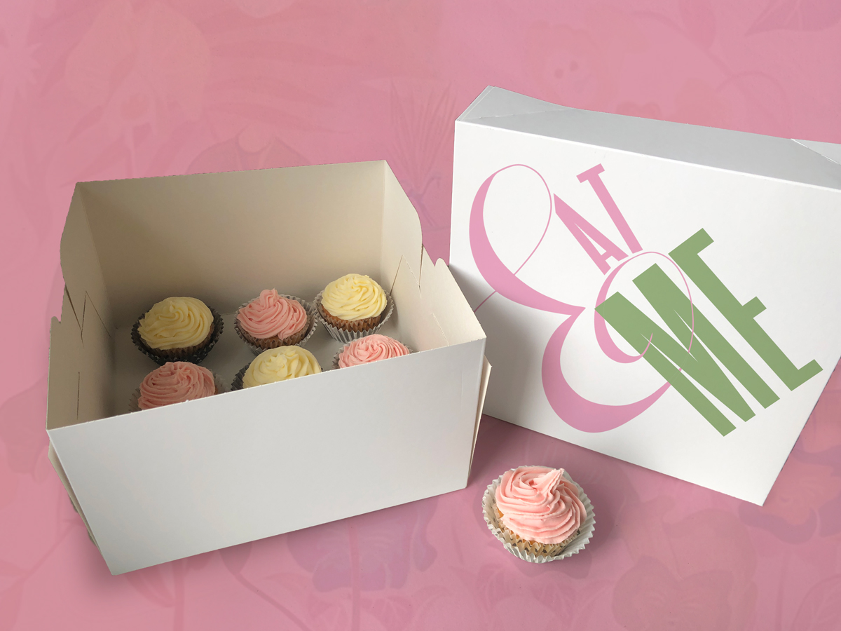
Alice's Adventures in Wonderland - Lewis Carroll, Grow & Shrink
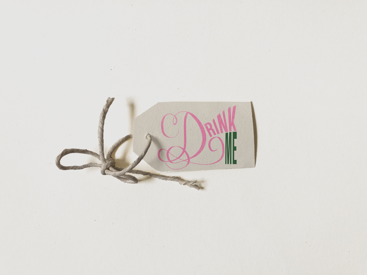
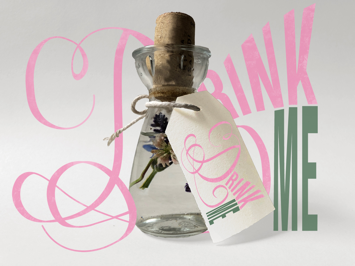
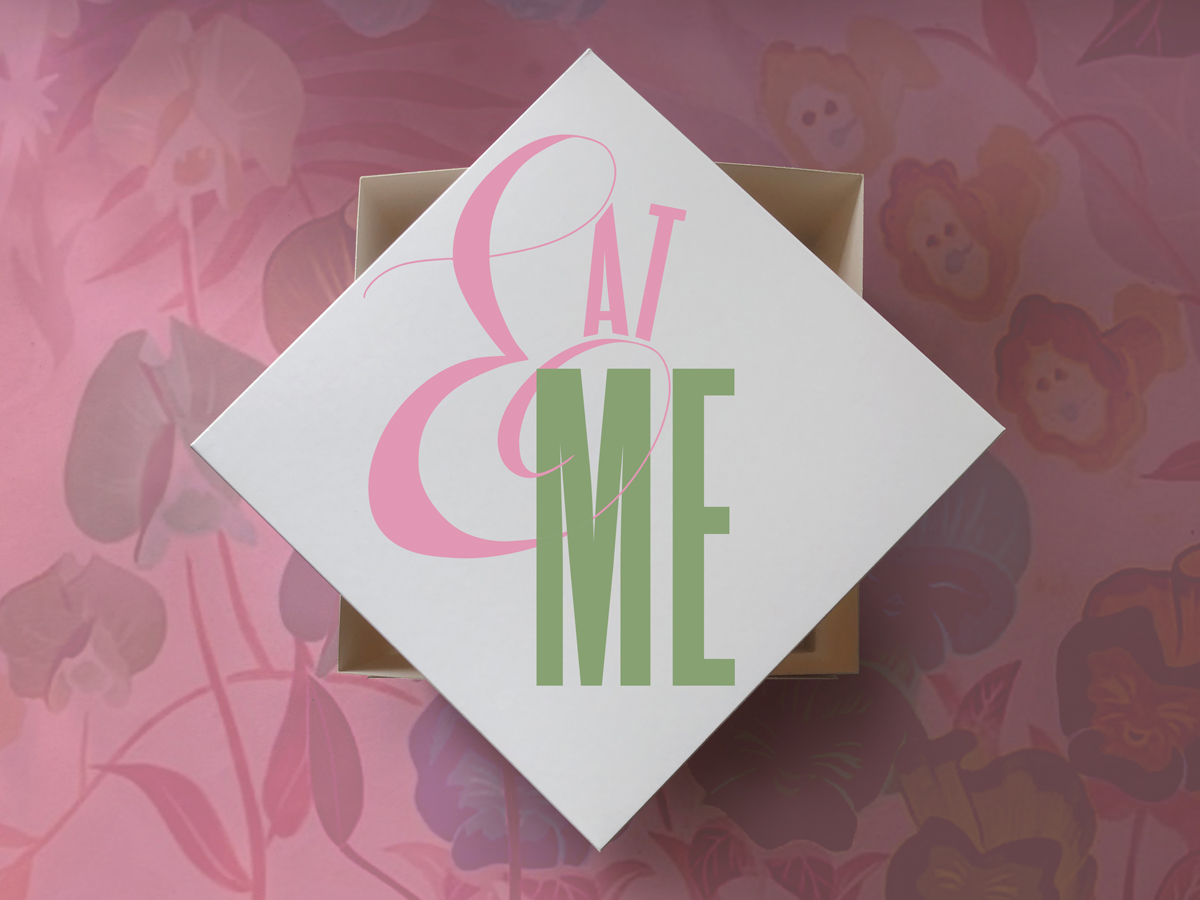
"Tied round the neck of the bottle was a paper label, with the words ‘DRINK ME’ beautifully printed on it in large letters"
For these Alice and wonderland props I took more of a modern take and was inspired by the current identity for the 2021 V&A Alice in wonderland exhibition, designed by Tom Hingston.