Lucid
Film Production & Poster Design
In collaboration with Hannah Wedlake
About Our Creation
After seeing an advertisment for the BFI's Future Film Festival myself and recent film production graduate Hannah Wedlake said "shall we make a film?!" and that we did, with a tight submission deadline. Over the course of about a week we wrote, filmed, edited and created promotional materials for our film 'Lucid'.
The Process
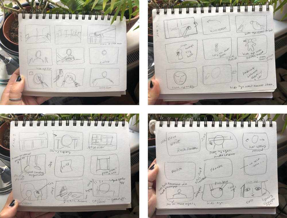
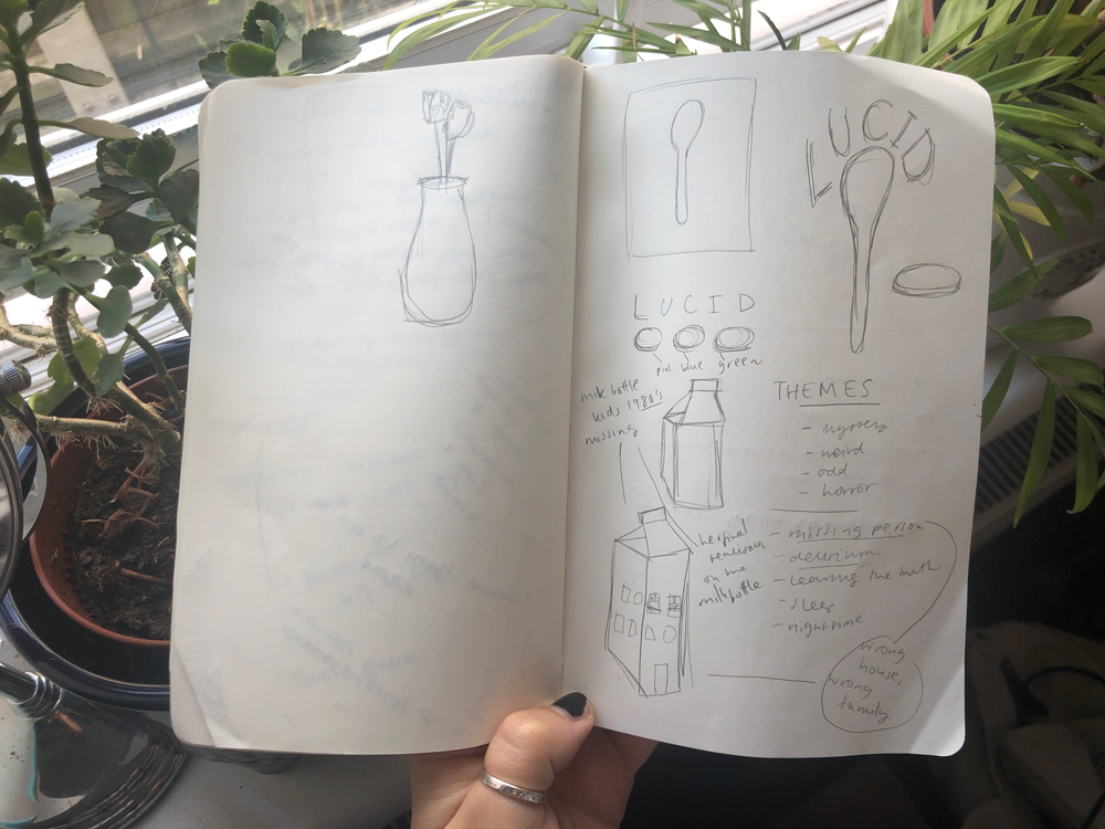
Receiving the Script & Creating Storyboards
Hannah's specialism is writing and so, after deciding our themes and basic plot line she got to work on the script. Hannah then sent it over to me for edits and to ensure that the storytelling was clear. Once we were happy with the script, I sketched out our storyboards and rough shot ideas in order to make the tightly scheduled filming process run smoothly.

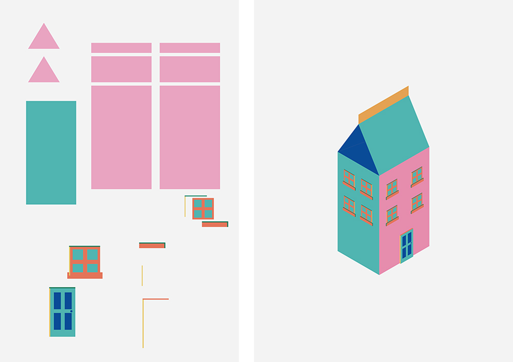
The Milk Carton
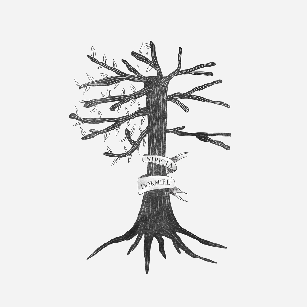
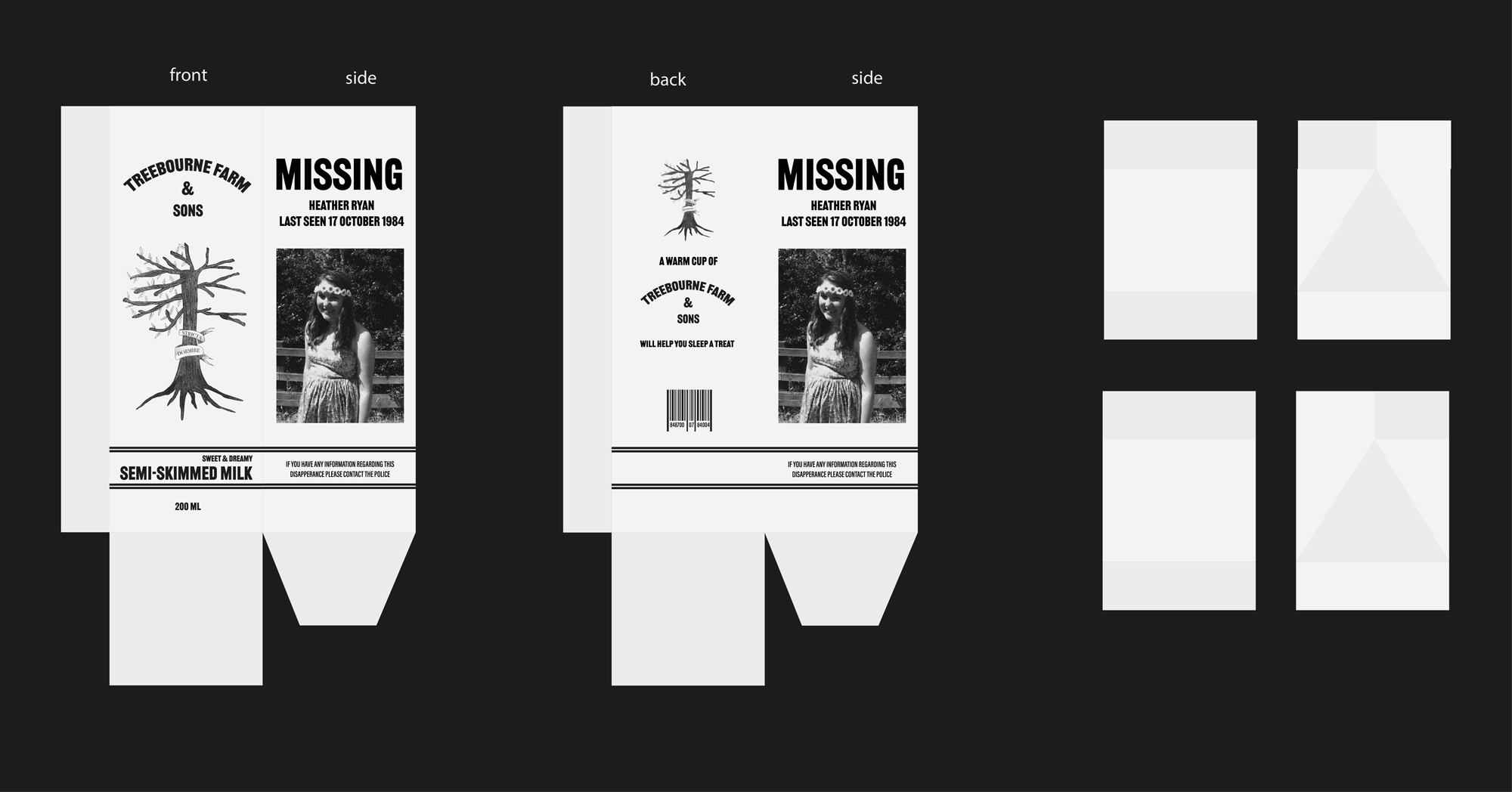
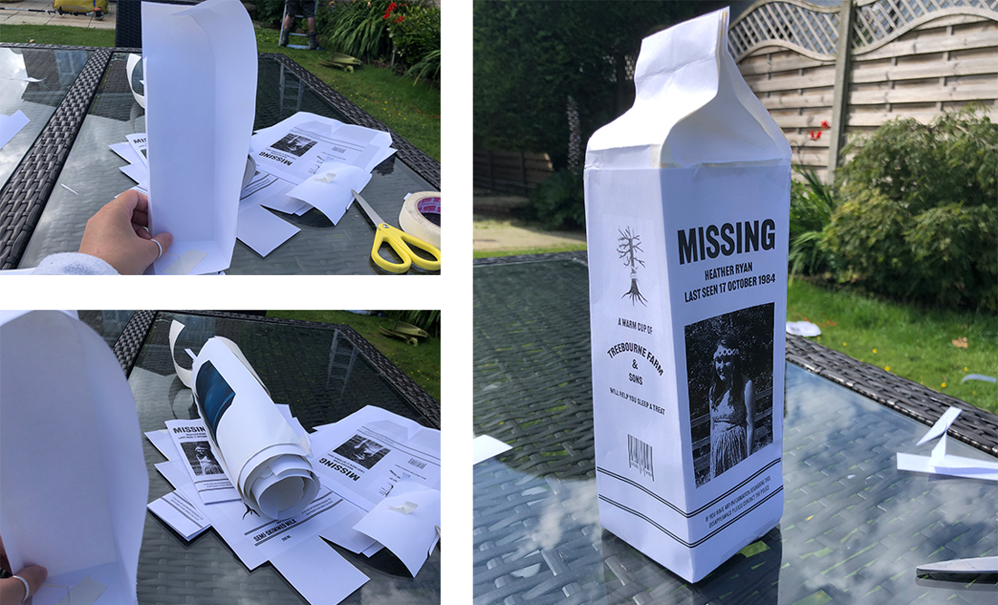
Our film takes place in the 1980's and during this time children's missing posters were featured on milk cartons. Taking from this, the milk carton plays an important part in the film to certify to the protagonist that her reality has been altered for some time.
As the production designer, I designed the carton and missing poster. To ensure the carton looked realistic I created a fictional milk company and subsequent logo for this. The logo is based on the 'tree of life' but only half has leaves, a nod to the idea that she is not living the life she was supposed to. Furthermore, the latin text wrapped around the tree translates to 'sleep tight'.
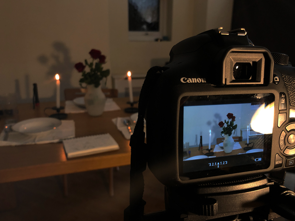
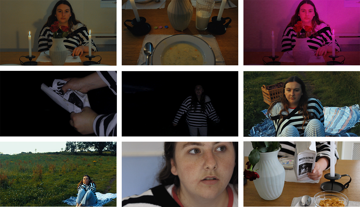
Filming & Experimental Lighting
Myself and Hannah both worked to direct the film and as director of photography I set up the camera and its placement, referencing to the storyboards we had created.
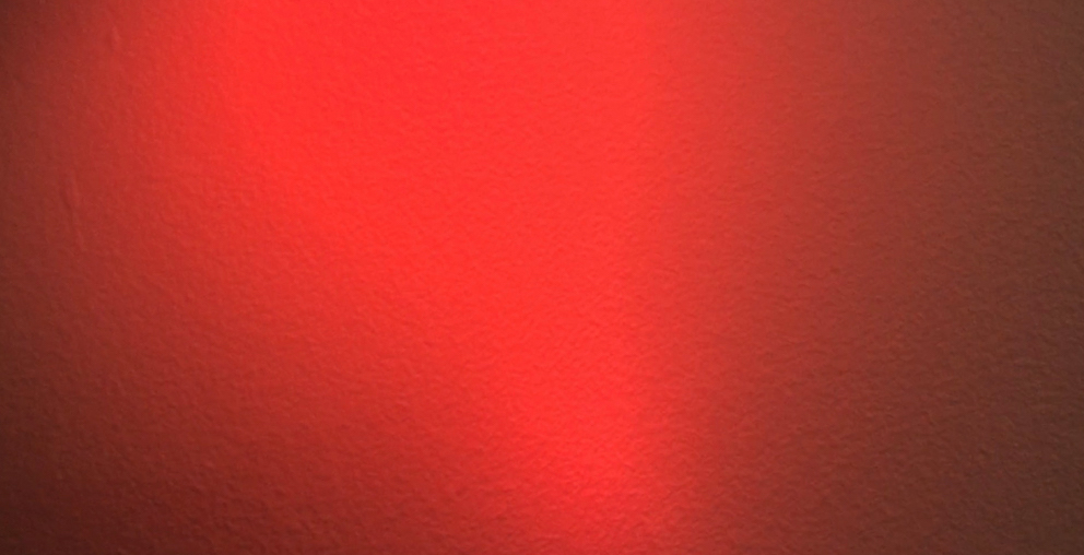
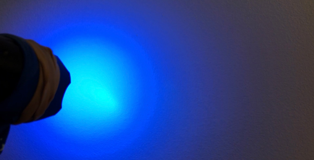
An important part of our film is having interesting lighting as this aids in telling the story through the characters state of mind. However, as a film on a budget we became very experimental with our lighting techniques. Using small torches with coloured balloons stretched over the light, I shone them on a plain wall and when editing, I overlayed this light footage onto the main footage with blending modes to create coloured lighting scenarios.
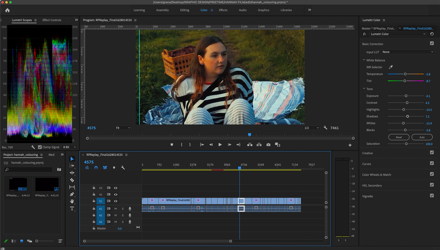
Editing & Colour Grading
The main role I took on in terms of editing was colour grading. I particularly enjoyed this as it allowed me to further tell the story through colour.
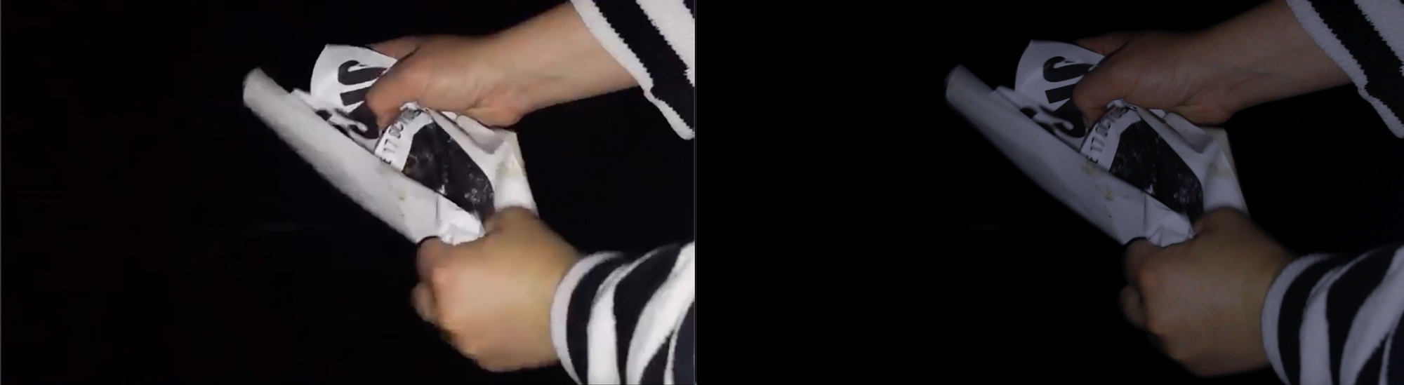
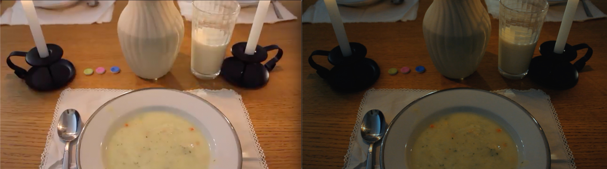
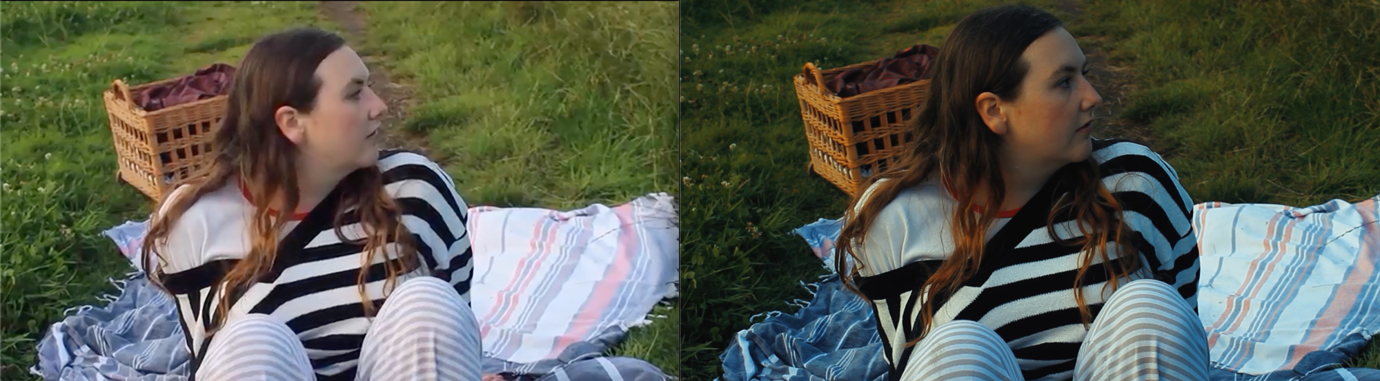
There are four main elements in terms of this which are, the warm, almost 'too perfect' dinner scene which when shooting we also made sure to make everything oddly symmetrical. Secondly is the colourful lighting where we see the alterations in her state of mind which we created with the lighting technique I mentioned above. The dream sequence features in two parts, night and a golden, warm and comforting memory scene which contrasts to the bleak paleness of when she wakes up in realisation.
These colours not only help to balance out the footage to ensure everything looks good visually, but it also significantly aids the storytelling and was a vital part of the process.


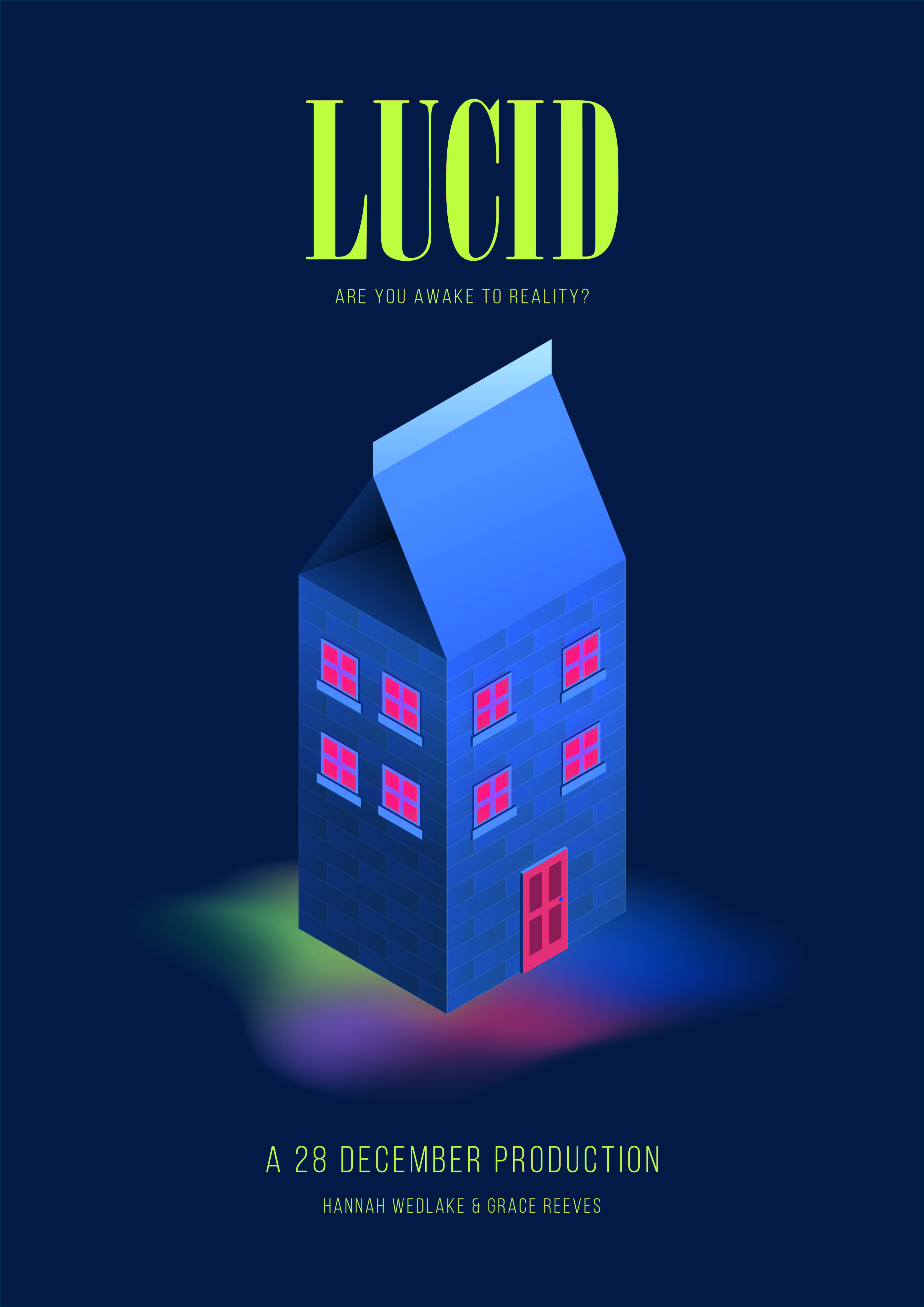
Creating the Poster
As we were entering our film into the BFI Future Film festival, we needed a poster to represent and potentially market 'Lucid'.
I began by sketching ideas, thinking of things that were most significant to the storytelling without giving too much away. I had a very specific vision that I wanted to execute which was of the milk carton in an isometric style. The milk carton is transformed into a kind of surreal house, referencing to the fact that the carton is the object that certifies to her that this place is not her home.
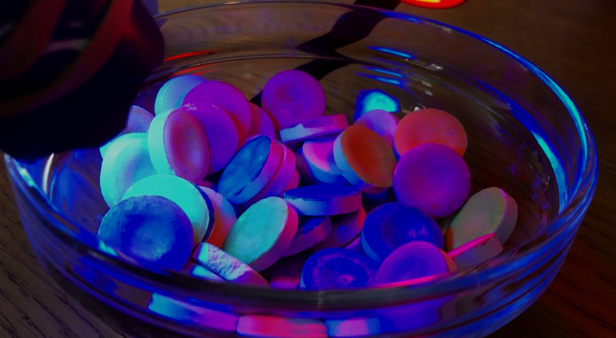
I have taken the colours from the 'pills' to create the palette for the poster design, adapting the blue to create gradients. The dark blue background sets the colourful gradient in a satisfying contrast.
Finally, Hannah and myself have the same birthday of the 28th of December thus, providing the name for our production start-up.
The Outcomes
The final outcome for 'Lucid' along with stills and the final poster design, entered into the BFI Future Film Festival 2021.