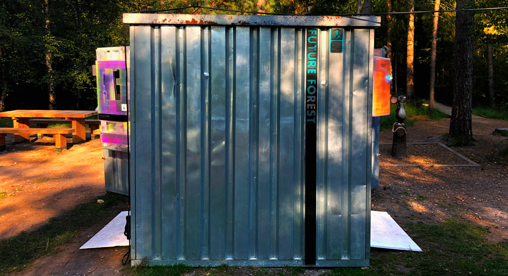
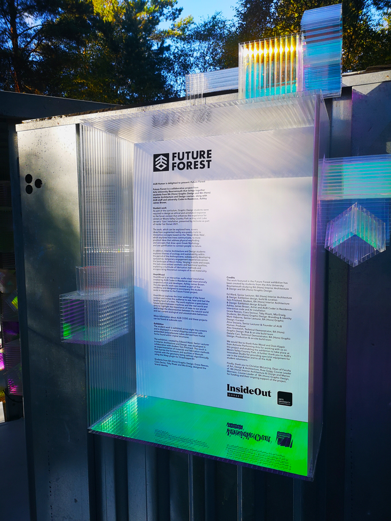
Future Forest
Branding & Exhibition Design
In collaboration with AUB Human, Activate & Inside Out Dorset
The Brief
For this project I worked alongside creatives at Arts University Bournemouth and in conjunction with AUB Human to create 'Future Forest', an installation exhibiting the work from AUB Graphic Design and Interior Architecture.
This project collates the work from our final second year project 'The Annotated Environment'.
Myself along with a small team of creatives from Arts University Bournemouth were asked to create the branding identity for the exhibition to encapsulate the project and exhibit the work at Moors Valley in September 2021.
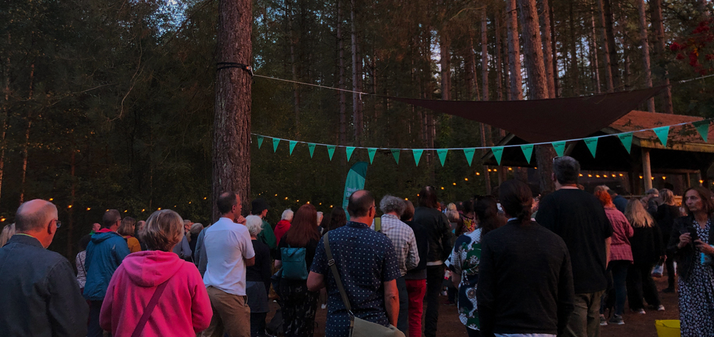
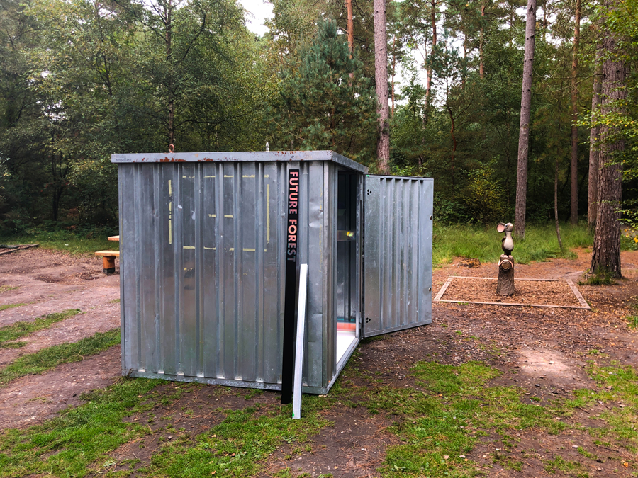
The Exhibition

The Process
Being Approached & Meeting the Team
I was approached, along with my team, to work on this years exhibition by my tutor at Arts University Bournemouth who is also the founder of AUB Human. We were asked initially to create the identity for the exhibition however, as the project progressed I began to delve into other aspects of the exhibitions production too.
After being asked our thoughts and agreeing to work on the identity, we met with the team of creatives that we would be creating the project alongside.
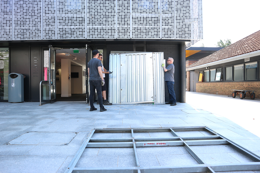
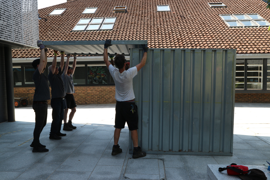
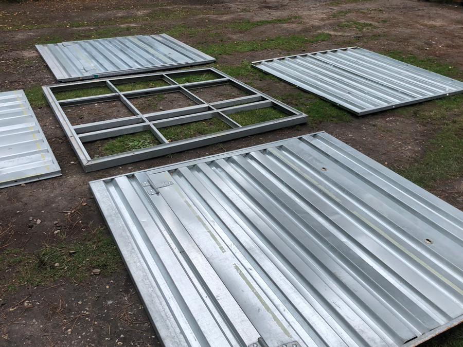
Test Build
Before designing any assets I joined some of the team for a test build of the container on campus which enabled us to get a better idea of what we were working with.
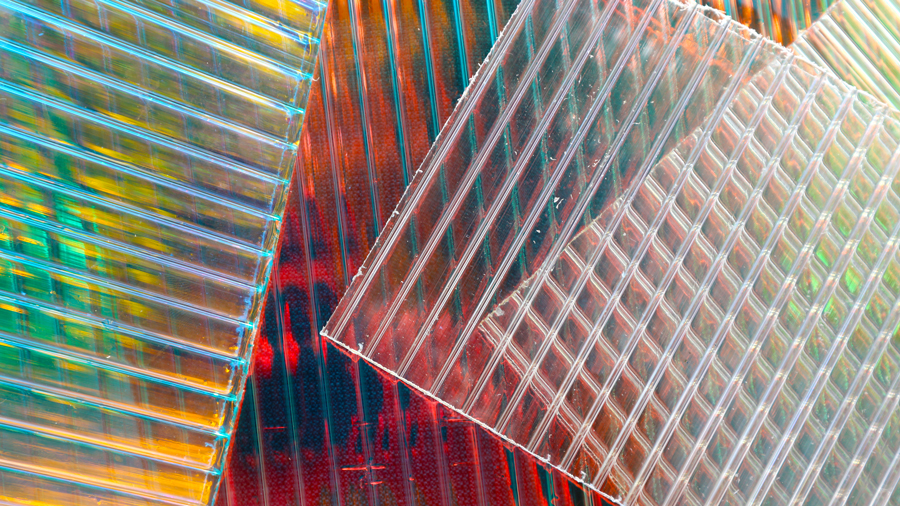
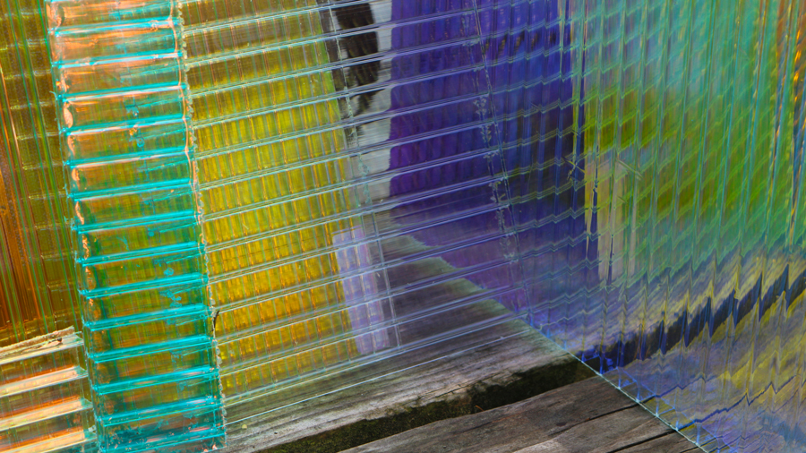
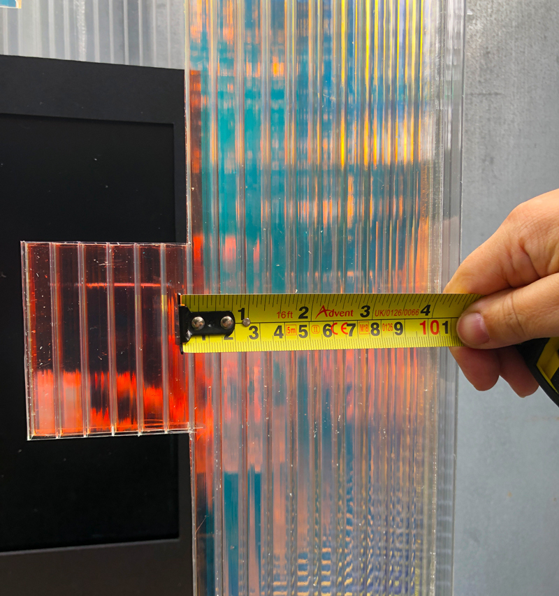
Materials & Colour
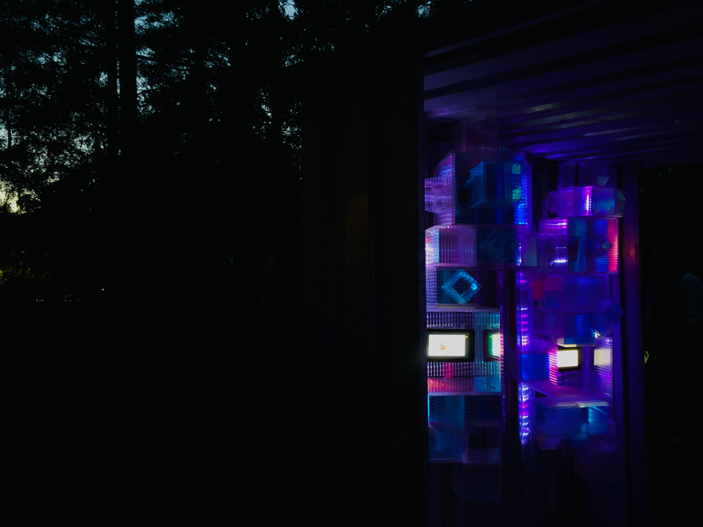
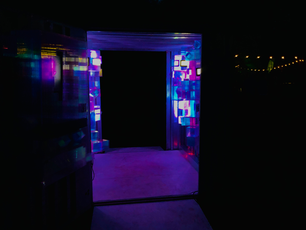
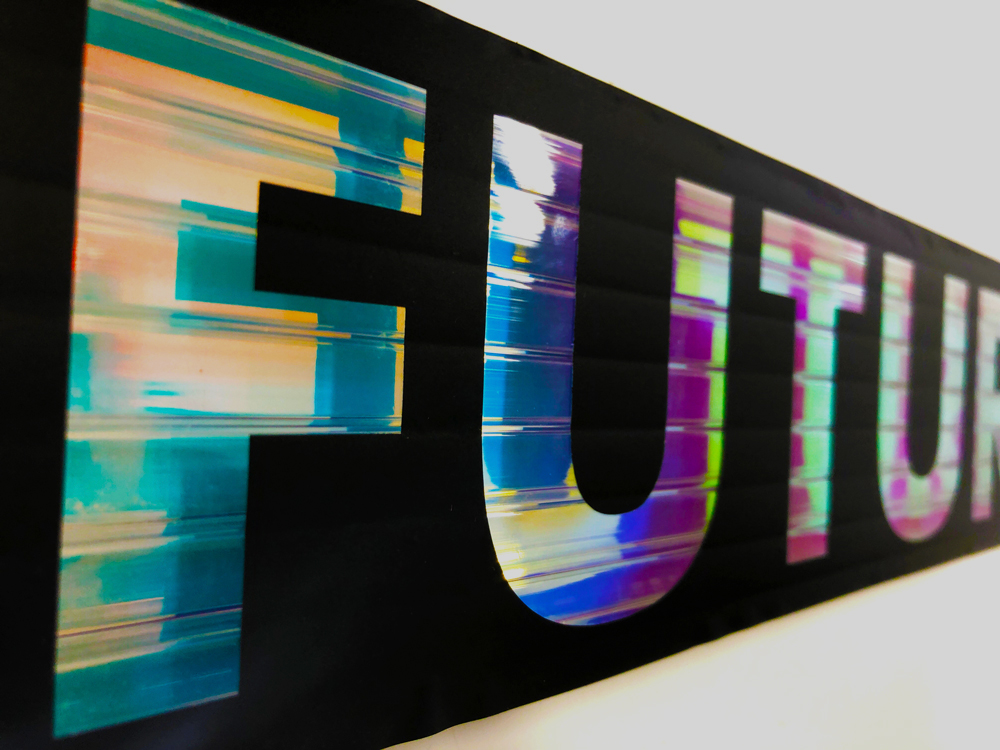
The consideration of materials was important for this project and one of the key materials was this iridescent vinyl which reflects many colours, particularly when there is light shining through.
My first idea was to use these colours within the identity however, we later decided to just use black or white as, because the iridescent vinyl can shine any colour, black would be the best to use to ensure any text could be read when placed on top of the coloured vinyl.
Creating the Cubes
After the Interior Architecture side of the team had created the cubes out of the plastic, I went to the studio to help them create the iridescent cubes by sticking on the vinyl.
It was a long process as there was a lot of cubes however, I learnt a new skill and the effect really pays off!
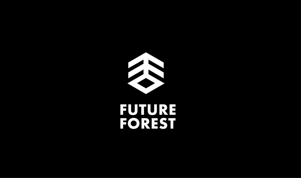
Logo Development & Creation
I wanted to create a logo that intertwined the forest and the futuristic cubes we had created. Therefore, I started by looking at isometric elements to create the cube and experimented with a few variations of how this could come together.
After much experimentation I discovered that the back to back 'F' could create a tree to symbolise the forest whilst also creating the cube shape through its isometric angle.
As a team we then developed this further to create the final design as well as choosing to use 'Futura' as the font as it is very legible and suits the themes well.
Paper Prototyping
Once we had our final logo I went back to the studio to test some paper prototypes against the container. This was to ensure the size, shape and placement of the logo and typography before creating it out of vinyl.
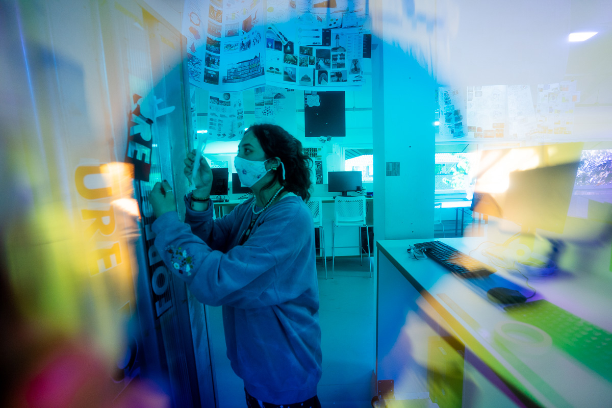
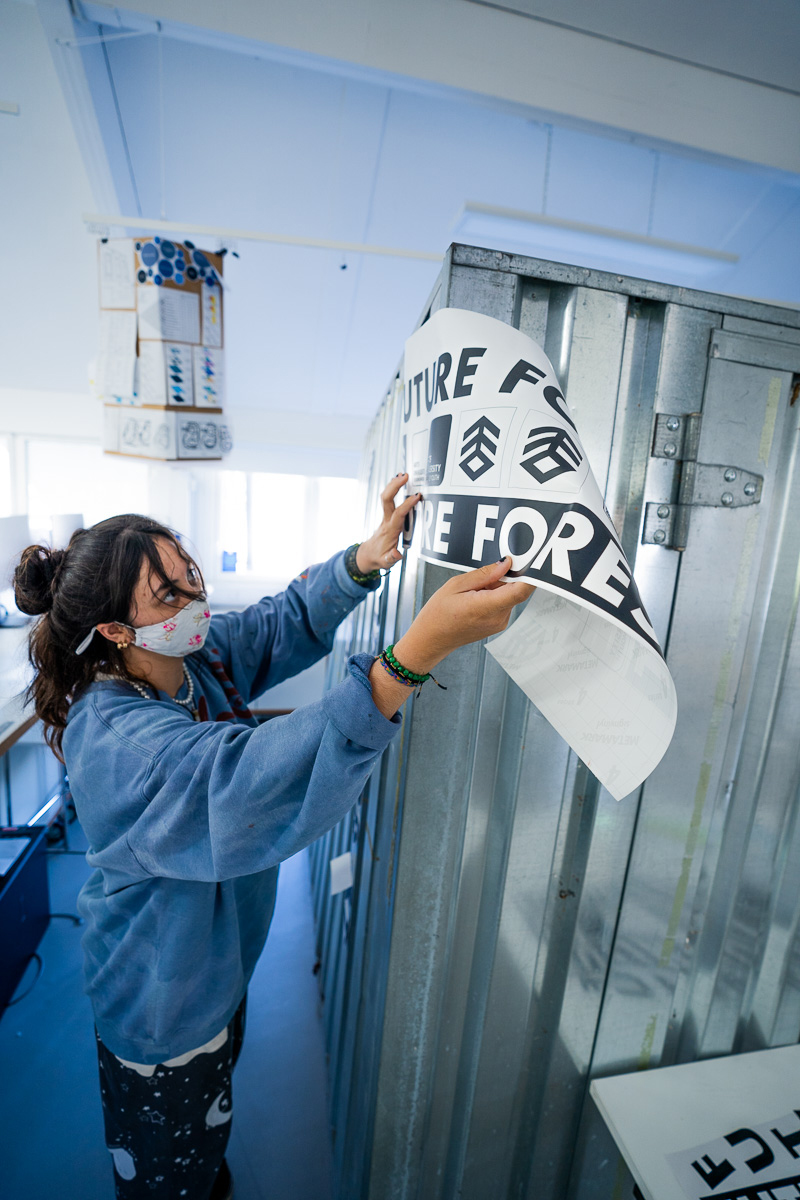
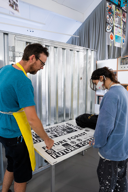
Vinyl
Vinyl was a new skill for me but I soon got the hang of it!
There were several elements that had to be created, weeded out and applied including the Future Forest and AUB logo and a long strip of Future Forest typography.


Collating the Work to Exhibit
Each of us contacted a few students from BA Graphic Design to collate their work for the exhibition, from this we gathered a range of exciting projects.
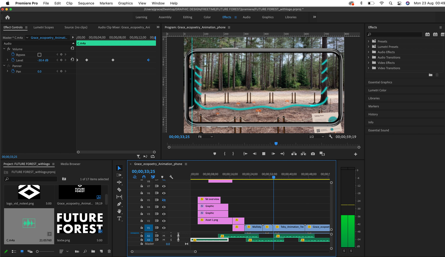
I designed storyboards and a video template that included the logo, sound and type so that when creating the videos individually these style elements remained the same.
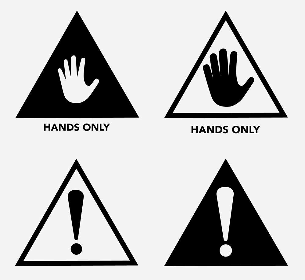
Designing Biographies & Warning Symbols
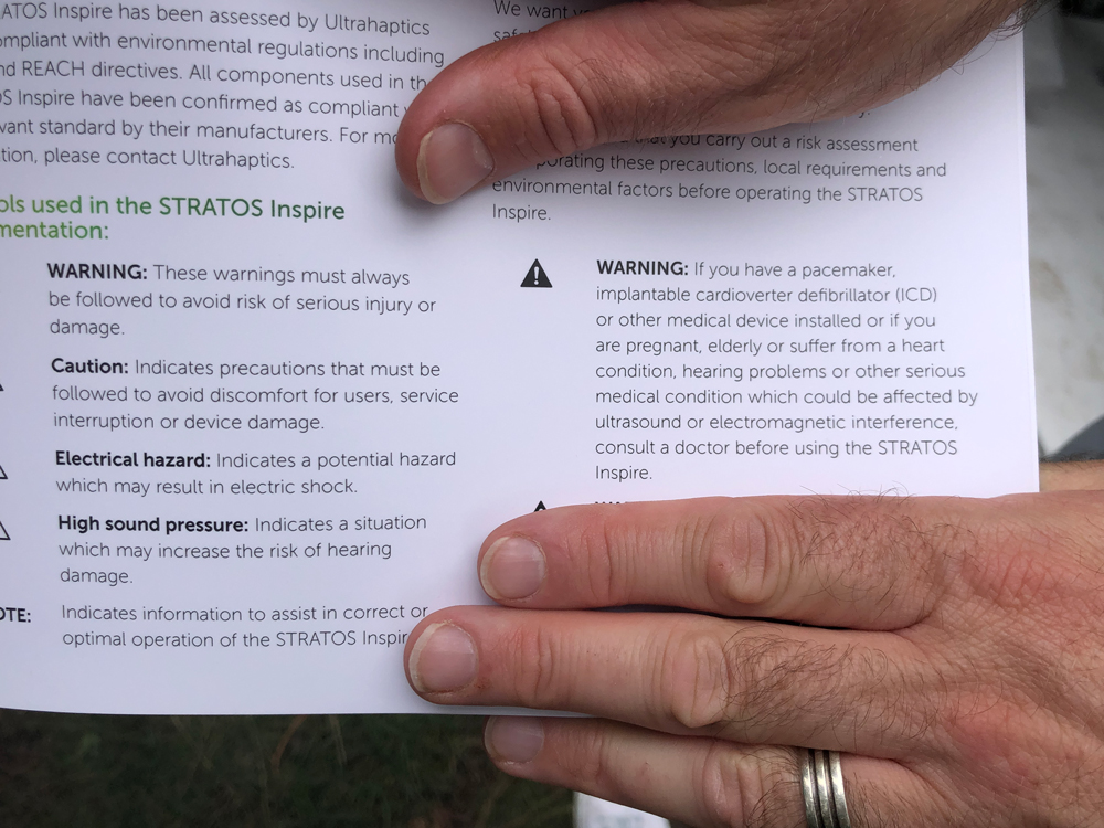
The interactive installation 'HeartWood' by Ashley, the AUB resident coder, required warning signs as well as instructive elements of how to interact. These needed to be clear and simple in order to communicate the potential risks and so I designed the simple 'hands only' symbol along with legible typography.
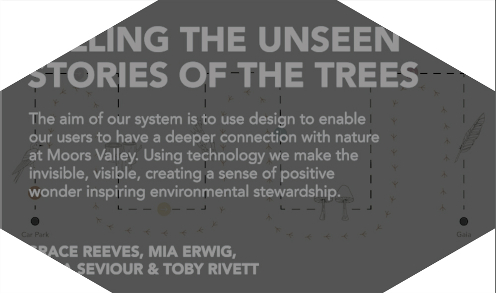
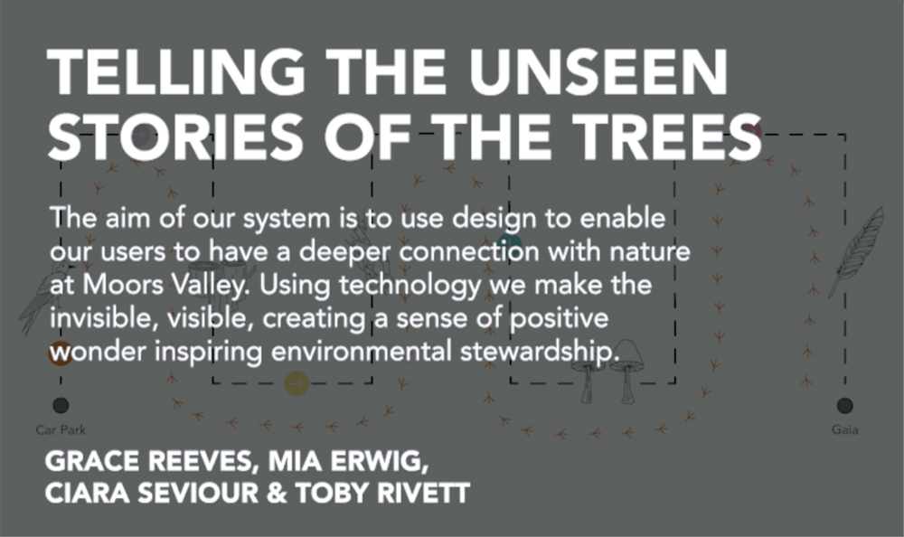
Myself, Ciara and Toby then created the exhibition's biography to explain what it was and also credit those who were involved.
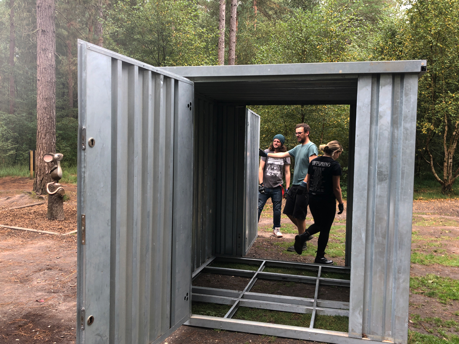
Preparing For the Opening Night
Two days before the private viewing and opening night of the exhibition I joined some of the team on a trip to Moors Valley to set up the container as well as the vinyl and cube elements on site.